The Appearance tab on the Options
Window enables you to specify appearance options.
VueMinder uses
Infragistics AppStylist
theme files to control its appearance. A number of theme files
are packaged with VueMinder. You can preview the theme files to
find the one you like the most. Or, if you like creating your
own themes, you can click the Customize button to create your
own theme file.


Themes can be created and customized by clicking the Customize button. The currently selected theme will be used as a starting point in the Appearance Theme Editor.
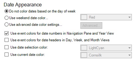
By default, weekend date numbers
have the same color as other date numbers in the
Navigation
Pane, Calendar View, and when
printing.

A weekend date color, such as red,
can be selected by selecting the "Use weekend date color"
option and then picking a color from
drop-down list. The date colors will update, as shown in the
example Navigation
Pane below:

If you'd like more control over
the date colors, like assigning each day of the week a
different color, click the "Use advanced date color
settings", and then click the "Advanced" button. The
following window will be displayed.

Using the example colors selected
in the "Day Colors" window above, the Navigation
Pane appears as shown below.

The "Use event colors for Navigation Pane dates" checkbox enables control over whether the Navigation Pane colors dates based on the appearance of the events they contain. When checked, the Navigation Pane will appear as shown below, where some date colors override the day-of-week color setting. For dates that contain multiple events, the date color will be based on the earliest event. In the case where there's a tie, such as dates that contain multiple all-day events, the order of calendars in the Calendar List will be used to break ties. Calendars that are higher in the list will take priority when coloring dates.

When unchecked, the Navigation Pane will appear as
shown below, where date colors always use the appearance
option and dates containing events are bold.

The "Use event colors for Date Colors in the Day, Week, and Month Views" checkbox enables control over how date headers are colored. When this option is checked, date headers will use the appearance of the first event occurring on the date, as shown in the example below.

If you don't like the default highlight color used for the selected date, you can select a different color after checking the "Use date selection highlight color" box. In the example below, the selected date is colored orange instead of the default light-blue.

As with the selected date color, you can optionally choose a color for the current date. This option can be used to help the current state be more apparent when looking at the calendar. To select a color, first check the "Use current date color" box.

If you have questions that aren't answered here, you can reach our support team at support@vueminder.com. If you're using VueMinder Ultimate you'll have our top priority. Otherwise, we'll reply as soon as all VueMinder Ultimate requests have been completed (and always within 1 business day).